Row Responsive Settings
Each row of the page includes some columns. You may have a row divided into 2 columns, 3 columns, and so on.
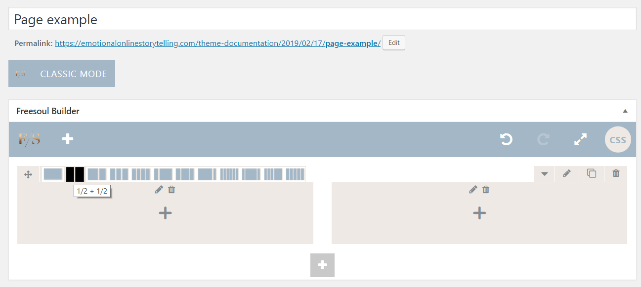
You can define the number of columns of a row by selecting one of the symbols that you see in the following picture.

In the example above we have a row composed of 2 columns.
We need to distinguish between the real columns as defined before and the grid columns.
The grid columns, contrary to the real columns, don’t exist on the page. They are imaginary columns that we use to measure the width of the page. Imagine a grid on the page composed of 12 grid columns.
The following row has 4 real columns, We imagine the full width is composed of a grid of 12 grid columns. So we have 4 real columns and each column is composed of 3 grid columns (3 x 4 = 12).
First column
Second column
Third column
Fourth column
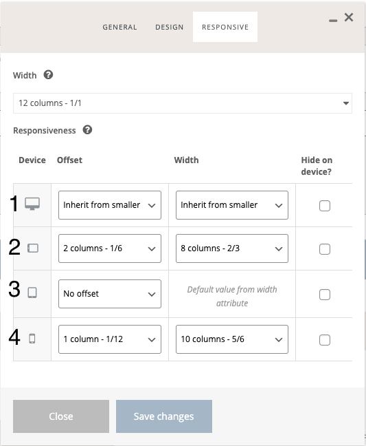
Clicking on the tab “Responsive” we can set the width and the offset of the real columns in grid-columns units.
In the example above we have 4 real columns with 0 offsets. Every column is 3 grid columns.
Offset means that you move the columns to the right.
When you see “Inherit from smaller” it means it inherits the value of the smaller device.
In the responsive settings we have 4 device screen size breakpoints:
- Desktop
- Tablet rotated
- Tablet
- Smartphone

In the example from the picture on the left we have:
1) Offset: 2 grid-columns, Width: 8 grid-columns (because they are inherited from the smaller device that is the Tablet rotated)
2) Offset: 2 grid-columns, Width: 8 grid-columns (directly selected for that device)
3) Offest: 0 (directly selected), Width: 12 grid-columns (Default value, this is what you set in the top)
4) Offest: 1 grid-column, Width: 10 grid-columns (directly selected)
As a best practice, to have a fully responsive page without problems on smaller devices, you should have 12 grid columns in the main dropdown list on the top, and select the desired offsets and widths for each device size.
