Mobile version
To optimize the mobile version without touching any code, you have:
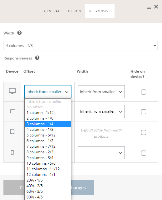
- The columns responsive options
- Empty space conditional visibility

You can set the offset and width of every column for:
- Desktop
- Tablet landscape
- Tablet portrait
- Mobile portrait
To access the responsive settings edit the column by clicking on the pencil icon and click on “Responsive”.

In the empty space settings you can decide if the empty space should be applied on:
- Only desktop
- Only mobile
- Only when the main navigation collapse in the so-called “hamburger menu”
In the following video, you can see how to quickly check the responsiveness of your website.
On Appearance => Customize you can check the responsiveness of your website.
You can simulate different devices and run a dynamic screen width animation, that will give you the possibility to quickly check if your design is fully responsive.
The simulation takes only into account the viewport sizes. Use it for preliminary testing. If you want to be 100% sure about the responsiveness do the final tests on real devices.
