Freesoul Builder
Using Freesoul Builder you can build complex layouts in no time without renouncing to good page loading performance.
How to chose what kind of pages you want to edit with Freesoul Builder.
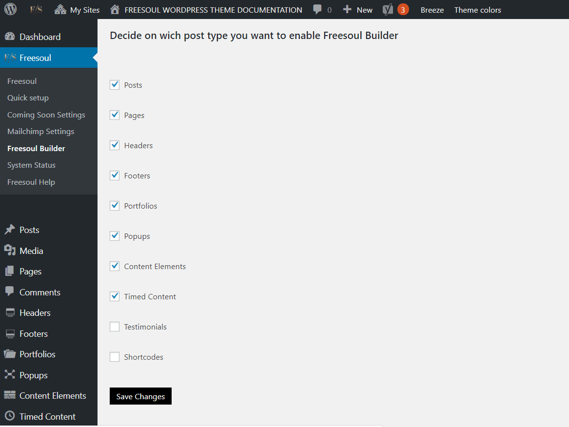
To select which kind of pages you want to edit with Freesoul Builder, go to Freesoul => Freesoul Builder from the main admin navigation.
How to switch to Freesoul Builder if it’s not already the default editor.
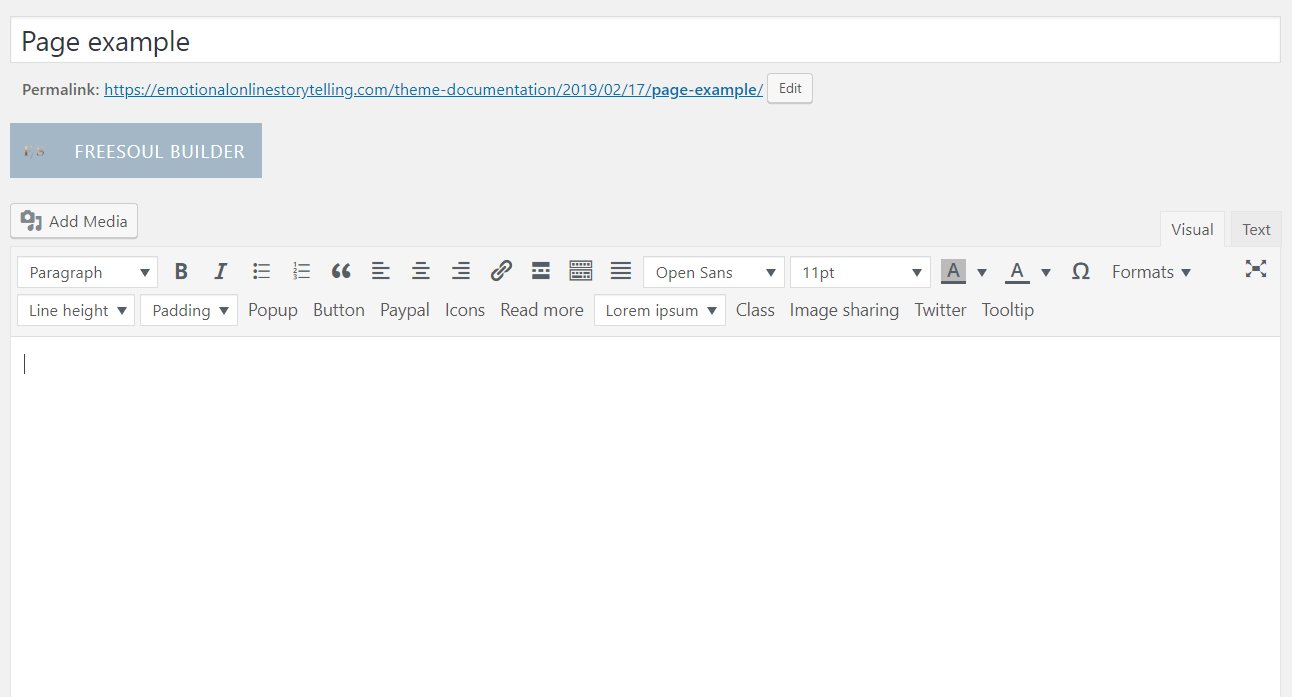
When you create a new page, if you selected that kind of page in the Freesoul Builder options, you should already see all that you need to start building your page, but if for unexpected reasons it’s not so, click on the button “FREESOUL BUILDER”.
First steps.
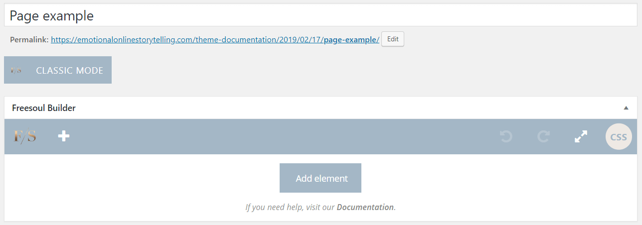
The first step is to click on “Add element”
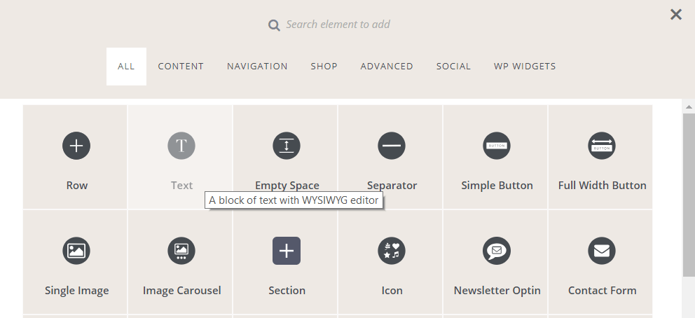
Then you will see a popup including all the provided elements. Choose what you need.
If you stay with your mouse on the element, you will see its description. This will help you to understand the functionality of that element.
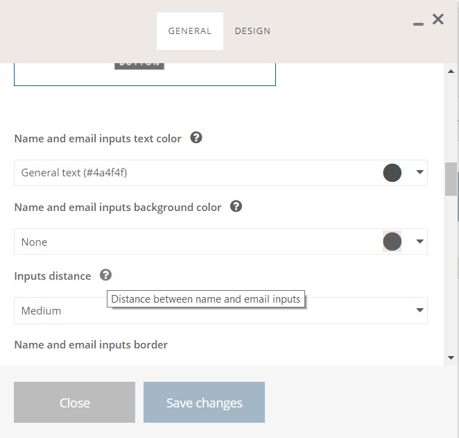
After clicking on an element, you will see a popup including the options of that element.
If you stay with your mouse on the question mark icons, you will see the related parameter description.
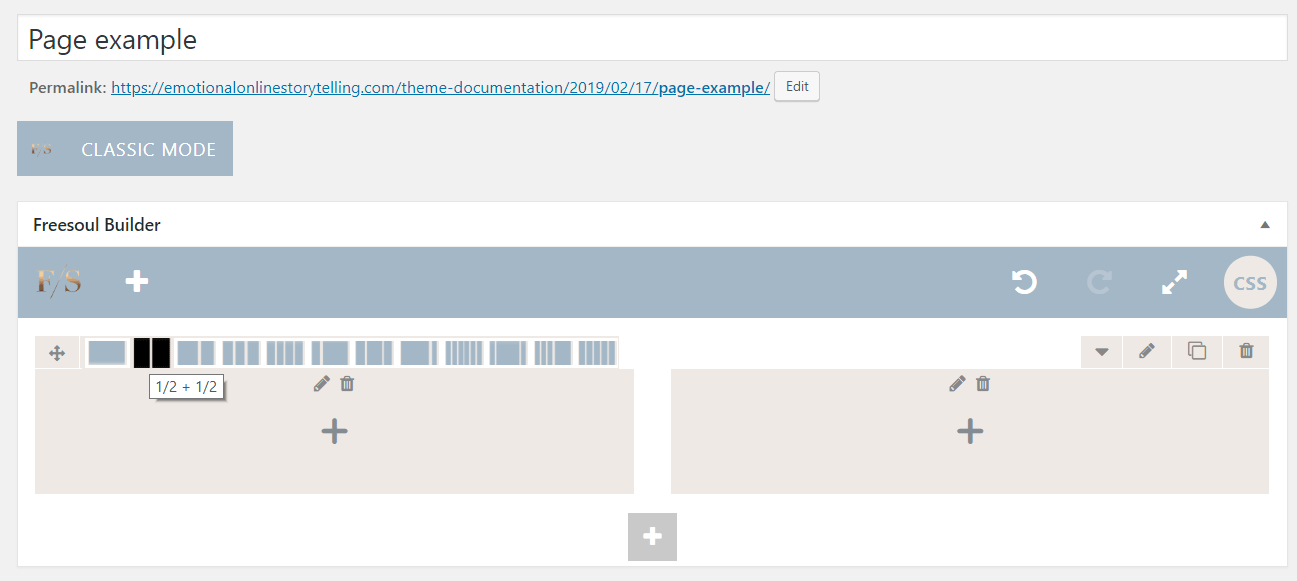
You can define the number of columns of a row, going with your mouse on the specific icon as you see in the picture above.
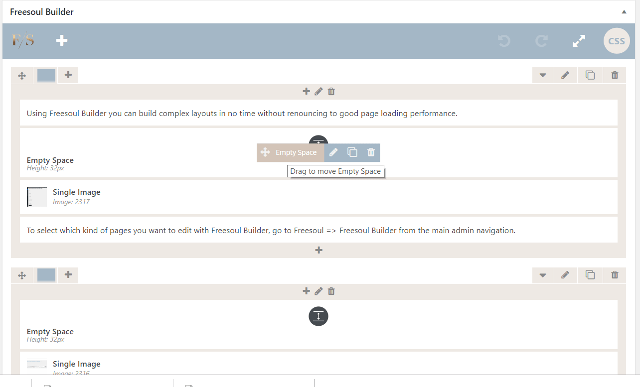
Drag single elements and entire rows.
You can drag and move every element inside and outside its wrapper.
For the single element, just stay with your mouse on it and you will see the control icons group. The first on the left is what you need to move your element. Keep clicking on it.
For moving entire rows, just keep clicking on the four arrows icon on the row top left.
Available controls for elements and rows.
As you can see from the picture above, both the single elements and the rows control icons groups allows you to do the following operations:
- edit
- clone
- delete
Elements and rows design options.
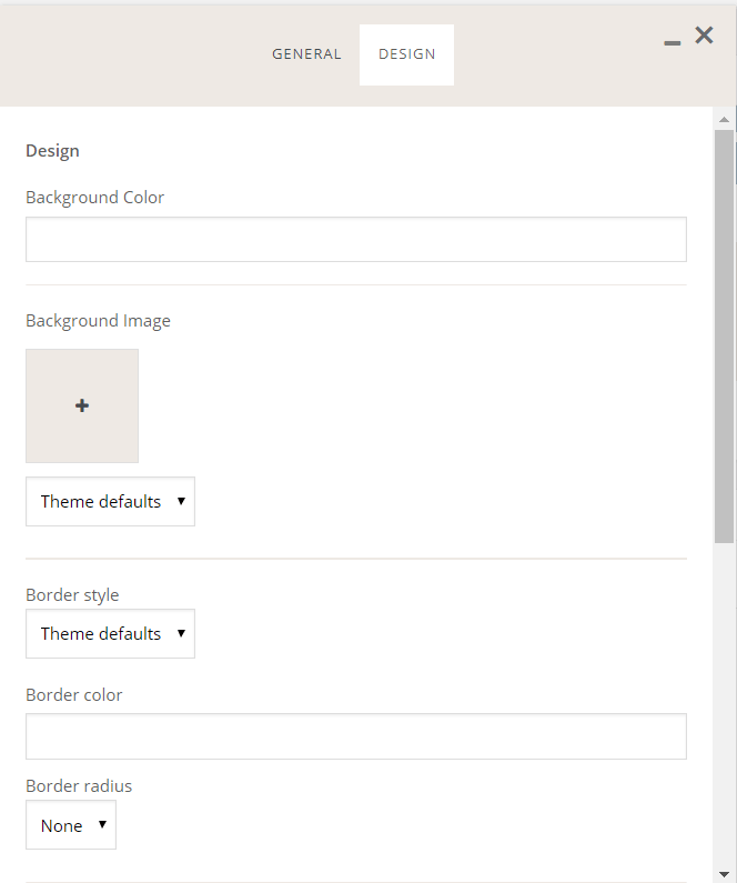
For some elements including the rows, you will be able to set:
- background color
- background image
- border
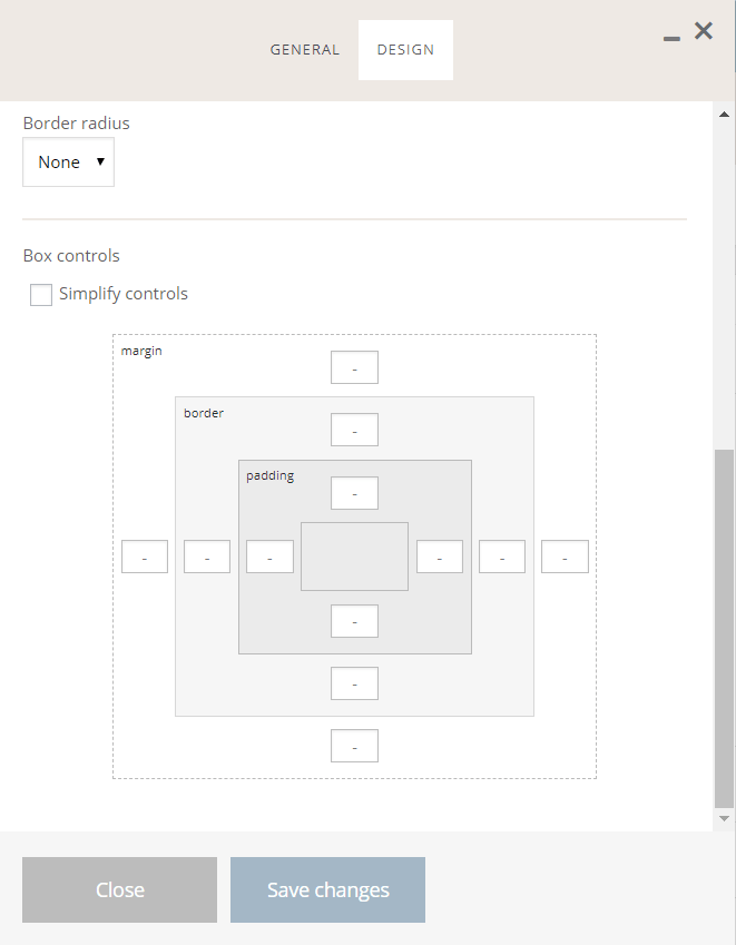
Moreover, you can define the sizes of:
- padding
- border
- margin
Columns responsive options.
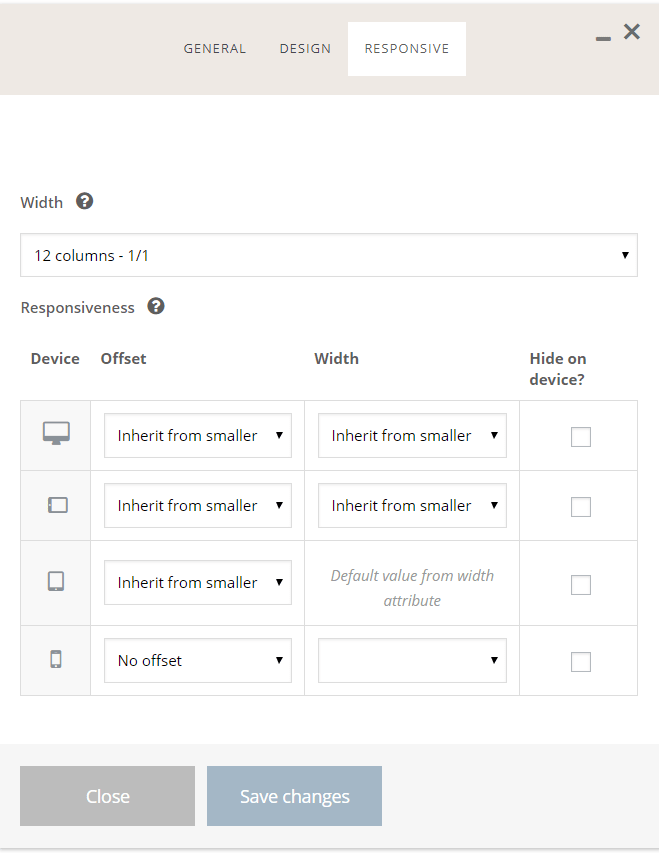
To set the offset and the column widths depending on the device screen size, click on the “Responsive” tab of the column options.
Custom page CSS.
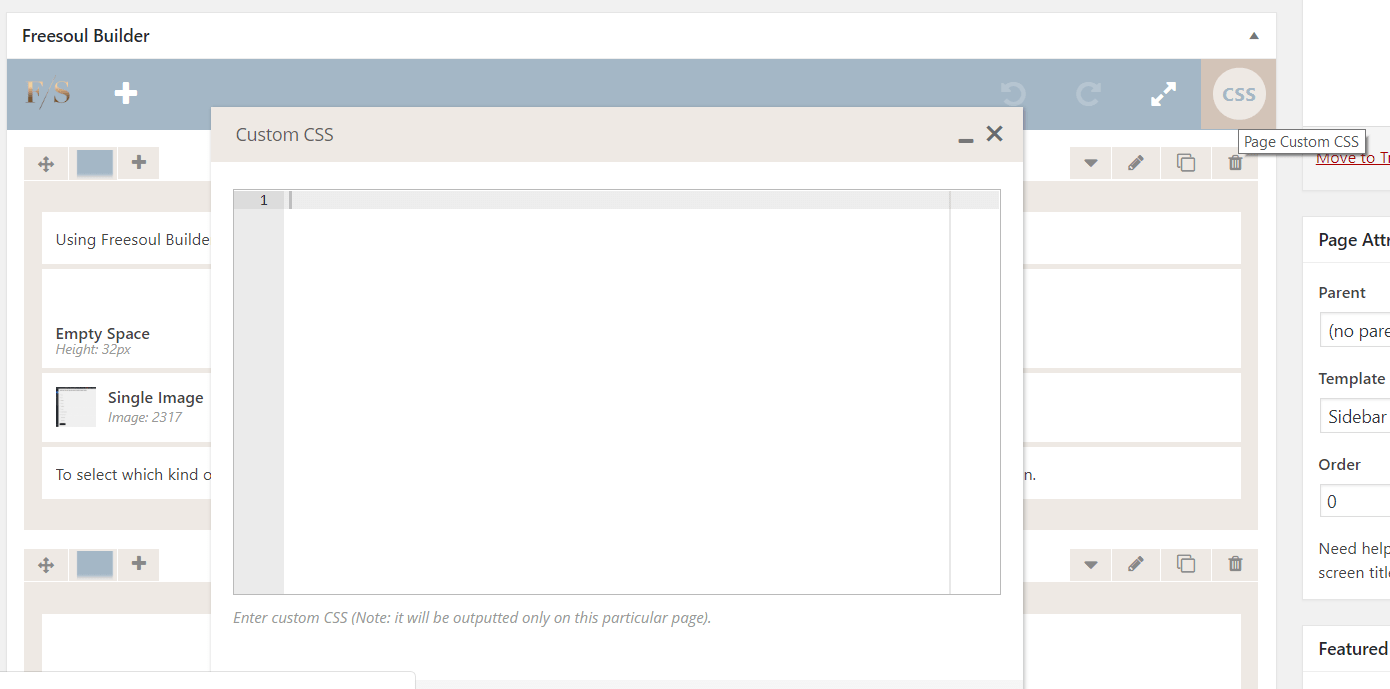
Clicking on the rounded button “CSS” you will be able to write the specific page CSS (Cascading Style Sheets) that will be loaded only on that specific page.
